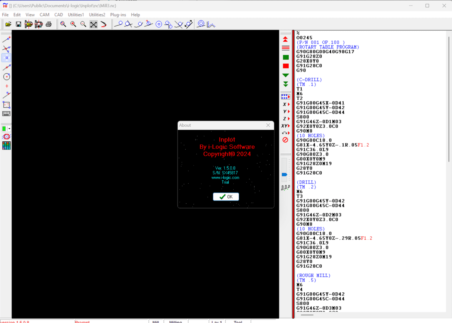
Description
Inplot by i-Logic Software: A Complete Expert Review for Data Visualization and Scientific Plotting
Summary
Inplot by i-Logic Software is a specialized plotting and data visualization solution designed for users who need precise, publication-ready graphs and analytical charts. Unlike generic spreadsheet chart tools, Inplot focuses on scientific accuracy, customization, and professional-grade output quality. It is widely used in engineering, research environments, and academic work where data representation must be both visually clear and technically reliable. With an emphasis on flexible plotting controls, high-resolution exports, and structured data handling, Inplot stands out as a practical tool for professionals who depend on accurate visualization for decision-making, reporting, and publication.
Introduction
In today’s data-driven environment, the ability to transform raw numbers into meaningful visual insights is essential. Whether you are working in research, engineering, statistics, or technical reporting, data visualization tools play a critical role in simplifying complexity.
Inplot by i-Logic Software is designed specifically for this purpose. It provides a focused environment for creating detailed graphs, scientific plots, and publication-quality visuals without the limitations commonly found in general-purpose spreadsheet tools.
Unlike basic charting applications, Inplot emphasizes precision, customization, and control over every aspect of graph creation. This makes it especially useful for users who require technical accuracy alongside visual clarity.
As organizations increasingly rely on data interpretation for strategic decisions, tools like Inplot are becoming essential in both academic and professional environments.
Key Features of Inplot by i-Logic Software
Inplot offers a structured set of features tailored for advanced plotting and data visualization tasks.
1. Advanced Plotting Capabilities
Inplot supports a wide range of plot types including:
- 2D scientific graphs
- Multi-series plots
- Statistical charts
- Curve fitting visualizations
- Custom graph layouts
These options allow users to represent complex datasets in a meaningful way.
2. High-Precision Data Handling
Accuracy is central to Inplot’s design. Users can input structured datasets and generate graphs with fine control over scaling, axes, and data representation.
Key benefits include:
- Precise axis calibration
- Flexible unit representation
- Support for large datasets
- Clean numerical rendering
3. Customizable Graph Design
One of Inplot’s strongest advantages is its customization system. Users can adjust nearly every visual element:
- Axis labels and fonts
- Grid styles
- Line thickness and color schemes
- Legend positioning
- Annotation tools
This ensures that every output matches professional publication standards.
4. Publication-Ready Export Options
Inplot supports high-resolution export formats suitable for research papers, presentations, and reports.
Common export features include:
- Vector-based outputs
- High-DPI image formats
- Print-quality scaling
5. User-Friendly Interface for Technical Users
While Inplot is powerful, it is structured in a way that remains accessible to engineers and researchers. The interface focuses on function rather than unnecessary visual complexity.
6. Data Import Flexibility
Users can import datasets from multiple sources, allowing smooth workflow integration with other tools used in scientific and engineering environments.
Practical Use Cases
Inplot is widely used in environments where data accuracy and visualization clarity are essential.
Academic Research
Researchers use Inplot for:
- Publishing scientific papers
- Creating experimental result graphs
- Statistical analysis visualization
Its precision ensures that published charts meet academic standards.
Engineering Projects
Engineers rely on Inplot for:
- System performance analysis
- Simulation result visualization
- Technical reporting
The ability to handle structured data makes it ideal for engineering workflows.
Data Analysis and Statistics
Data analysts use Inplot to:
- Identify trends in datasets
- Compare multiple variables
- Visualize statistical distributions
Industrial Reporting
Industries use it for internal reporting such as:
- Production performance charts
- Quality control graphs
- Operational efficiency tracking
Education and Training
Educators and students benefit from Inplot when learning:
- Data interpretation techniques
- Graphical representation of experiments
- Statistical visualization principles
Performance Analysis
When evaluating Inplot by i-Logic Software, performance plays a critical role in its effectiveness as a professional tool.
Speed and Responsiveness
Inplot performs efficiently with moderate to large datasets. Graph rendering is generally smooth, even when multiple data series are involved.
Stability
The software is designed for technical environments, which means it prioritizes stability during long analytical sessions. Users can work on complex projects without frequent interruptions.
Accuracy of Output
One of the strongest aspects of Inplot is its output precision. Unlike general chart tools that may simplify data representation, Inplot maintains strict accuracy in scaling and visualization.
System Resource Usage
Inplot is relatively lightweight compared to large-scale data analysis platforms. It does not require high-end hardware, making it accessible to most professional systems.
Workflow Efficiency
The structured interface reduces time spent on formatting and allows users to focus more on data interpretation rather than design adjustments.
Pros and Cons of Inplot by i-Logic Software
Pros
- High-precision data visualization tools
- Suitable for scientific and engineering applications
- Publication-quality export formats
- Flexible graph customization options
- Supports structured data imports
- Stable performance for professional use
- Lightweight compared to enterprise analytics tools
Cons
- Not designed for advanced AI-driven analytics
- Limited appeal for casual users or non-technical audiences
- Requires learning time for new users unfamiliar with scientific plotting
- Lacks modern dashboard-style visualization features found in BI tools
Pricing and Plans
Pricing for Inplot by i-Logic Software may vary depending on licensing type, user category, or institutional requirements.
Common licensing models in similar scientific software include:
- Individual licenses for personal or academic use
- Institutional or enterprise licenses for organizations
- Educational discounts for students and universities
Users typically receive access to full plotting features after activation, with potential variations in support and licensing duration depending on the plan.
For exact pricing, users usually need to consult official distribution or authorized sellers, as scientific software often uses customized licensing structures rather than fixed public pricing.
Inplot by i-Logic Software Developer
Inplot by i-Logic Software 1.5.0.8
Final Verdict
Inplot by i-Logic Software is a focused and reliable solution for users who need accurate, high-quality data visualization. It is not a general-purpose charting tool, nor is it designed for casual use. Instead, it excels in environments where precision, clarity, and technical correctness are essential.
Researchers, engineers, and analysts will find it particularly valuable due to its strong plotting capabilities and publication-ready outputs. While it may require some learning for beginners, the long-term benefits in accuracy and efficiency make it a worthwhile tool for serious data work.
For anyone working with scientific datasets or technical reporting, Inplot offers a structured and dependable approach to visualization that supports both analysis and communication.
If your work depends on turning complex data into clear, accurate visual insights, exploring Inplot by i-Logic Software is a practical next step toward improving your analytical workflow and presentation quality.



Reviews
There are no reviews yet.